GOODCOOK
Teammates: Natalie Harmon, Christie Chong
Role & Contributions: User research, brainstorming and concept ideation, visual design
Carnegie Mellon University | Spring 2016
Challenge
One of the most common resolutions ever is to eat on a healthier diet, but how often do people keep that resolution? How could we make this lifestyle more approachable and help people build habits of healthy eating?
Outcome
My team designed GoodCook to be a program that promotes healthy eating through peer collaboration and accountability. It takes the form of a system comprised of a spatial, print and digital piece.

SYSTEM OVERVIEW
Pop-Up Shop
The pop-up shop is our spatial piece on campus that draws interest and raises awareness about healthy eating and the GoodCook program. Here, students learn about the program and receive our second piece.

Bag
Our second piece is a paper bag that serves as a takeaway, providing more information about the program's benefits and steps. It comes with a vegetable and an easy recipe to motivate students to cook with the given ingredients.


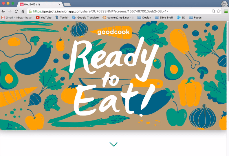
Website
Our digital piece is a website that includes features for scheduling who's cooking next, health goals, and marking favorite recipes the group has enjoyed together. It is the long-term tool that students use, until they make healthy eating into a habit that they do on their own.


RESEARCH�

We thought that time and work would be the greatest deterrents from cooking. However, from our research we found that people are actually afraid of cooking because they feel highly incompetent at it. So, we decided to lower the intimidation barrier and present cooking as a fun, sustainable and worthy habit for a healthy lifestyle.
When we thought more about our own eating experiences, we realized we are motivated to cook better when we are also preparing food for others. The expectation from others waiting for food is both an opportunity to impress and a source of accountability. Thus, we decided to create a group cooking program among users and their friends.
Interviews & Findings
We first took a look at our own thoughts on cooking and interviewed some of our peers to find out how often they ate well. We decided that college students like ourselves would be a really good group to focus on, because there was a great need for better eating habits and interesting constraints on a college campus.


In the end, we felt that several of our color palettes were too soft or too fruity for our "take action" message. Finally we decided on a unique, less realistic color palette, with an outline-less vector style and a brown background. These were fresh and bold colors, and the brown created an organic feel.
This style also worked well with the Gotham font family, which we chose for its round, friendly qualities.


My explorations:
Combined explorations:
Finding Our Voice
A powerful communication device would be our visual voice, so we took to testing out many different ones. We asked people how some of our favorite color palettes and art styles made them feel.


VISUAL LANGUAGE


Pattern Design
When we began developing final designs, we split up the production work. Natalie and Christie iterated on hand-lettering and illustrations. I took these components and created various patterns to be used on our three pieces. I also worked on some of the copy.
Bag Pattern (front, two sides, back):


Web pattern (banner):
Pop-up shop (large banner):


Style Guide
We consolidated our final decisions into a visual vocabulary style sheet. This describes our research validation, the context in which each piece exists, and how our written content and imagery work together:
Spatial Piece
To encourage cooking as a habit, our system needed to last for long-term use, but we still needed an initial touchpoint to get the ball rolling. Designing this piece was especially challenging, because it needed to lead people into the rest of our system. We decided to make it our spatial piece, because as a pop-up shop it could grab attention and allow for direct interaction with us. Christie quickly sketched out the space for us:
ITERATIONS

-
Defining a problem and identifying its constraints, audience, physical context and assumptions
-
Developing a system for long-term habit building that includes short-term calls to action
-
Developing a visual voice that is appropriate for the intended message and subject matter
-
Creating a cohesive system that flows across different platforms
-
Designing pieces that hold together on their own and when put together
LEARNING & IMPLICATIONS


Print Piece
For the bag we played with folding and printing on brown paper. Test printing led us to adjust our colors because they printed much darker on brown paper:
Digital Piece
For the website, we mocked up very surface level interactions like the dashboard to communicate its intended functionality. We considered how to transfer our patterns from print to an interactive digital platform and keep a coherent visual language.


