CONNECTING HISTORY
Information design, Layout design, Responsive media
Carnegie Mellon University | Spring 2016
Challenge
Research a designer from American history, and design 3 book spreads and a web page for his/her biography. Learn how different media affects the layout of content.
Outcome
3 book spreads and a responsive web page, inspired by the concise and structured style of Ladislav Sutnar, a Czech-American designer from the 1900s.
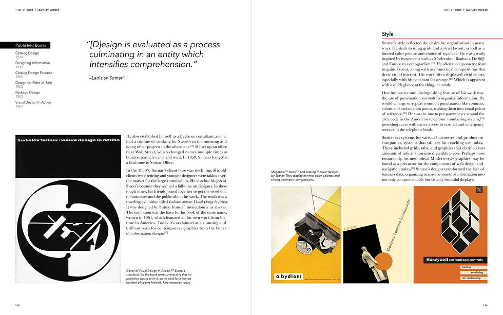
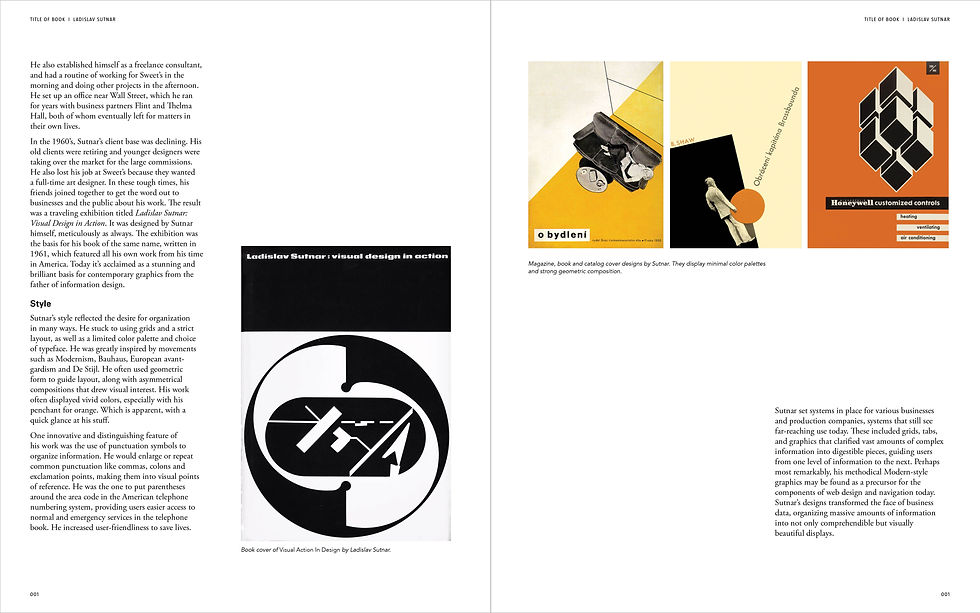
BOOK SPREADS


DIGITAL PAGES
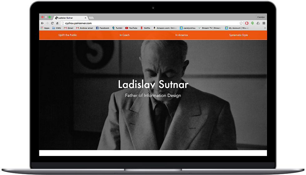


Web/Desktop view:
Mobile view:
In this project I gained a deep understanding of grids, layout, information hierarchy, typography, and more. The first part of the project consisted of 3 full print spreads, which I designed and laid out with biographical content about Sutnar that I put together.
In the second part of the project I looked at the affordances of different media, and considered how people interact with web pages than with book pages. I built a responsive webpage from scratch using HTML, CSS and JavaScript.
PROJECT OVERVIEW
Typographic Studies
These are a few of the studies I made while developing my style guide. I was looking for a typeface that would reflect Sutnar's clean and rigid style, so I studied classic serif typefaces for my body copy like Garamond and Caslon. I chose Futura for the headings because of its relation to the Bauhaus movement, which was prominent during Sutnar's time. Its geometric form also reflected Sutnar's bent for using geometric shapes and grids. In addition to typefaces I also looked at type size, color and weight.

PROCESS
Middle iteration:


Layout Iterations
My process work for developing layouts helped me to understand the final style and flow of navigation that I wanted to achieve, based on my research and how I wanted to organize information. View my full process work here.
Early iteration:
Final iteration:


LEARNING & IMPLICATIONS
-
Developing a hierarchy and organization of information
-
Understanding layouts, typography, grids, and composition
-
Heeding attention to nuances in text and image integration
-
Programming a web page from scratch using HTML/CSS/JavaScript
-
Maintaining visual consistency across different media
-
Understanding the affordances for interactions with print vs. digital media